Hey, Jeff, I want to ask you something if you have a minute. I know you run a company with hundreds of employees and several multimillion dollar clients, and therefore don’t have that much time for correspondence with freelancers from decades ago but….
Earlier today I had posted some comps somewhat whimsically about a new logo for my company, that I founded in 1994 . I am thinking of making some caps that are stitched with this logo or some T-shirts.
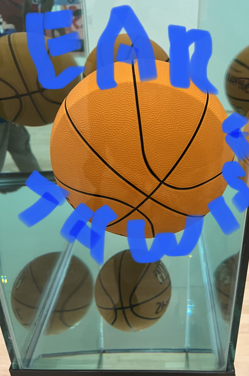
The comps are basically round or globular executions based on a turtle, a basketball, a rose, and one of those balls you can sit on or chair shaped like a ball that I found side of the road while riding my bike to my show 4 miles away Sunday . And subsequently left behind so to speak for the next user. Owner. Or steward.
What is the deal with your logo? When did you decide to have a logo and not just a type treatment, what was it called Gold Rush ‘88 or something? Gold Rush ‘88 Serif?
I noticed of course the G is both your name and could be the letter for color green. Likewise P for partners or pink. Is there a story behind the orange and the slightly oranger orange?
There used to be a band in San Francisco called Oranger, even better their album was called “Doorway to Norway”— it’s actually a Stanford guy who made some money on Excite.
I’m sort of open to an entire rebranding in that my name is a little bit abstract and just a pun on my father’s name.
I like breaking out the E-A-R, however, which implies listening .
Sometimes I break out the A-R-T.
Actuality our mutual friend JP once sent me from his notebook a logo for my last name with a “W” and an eyeball that was rather bloodshot and two snakes hissing.
W 👁 🐍 🐍 /sssss
Send me some comps and charge me what you have to to please the stockholders or you know put towards that Anish Kapoor really red choo-choo we were ruminating up on. Riding, not writhing.
Or as John Wooden would say be lithe but not hairy. Be silk? Be Slick but not Zelmo Beatty?
Bill badly cents of where you owe, your mic fee.