
The next day:
Arguably, GBS had an impact on me, via its workers — the creatives – and its works. So it is therefore possibly organic to accept from GS&P a design for an Earthwise Productions logo that could be stitched onto caps or pulled onto cotton tees.
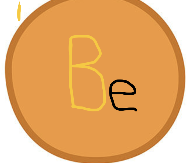
But what if I just took their four ball logo, with the G, S, &, and P and merely put an “E” for Earthwise (and, secondarily, “ear”) onto a blue or green ball — maybe the same green as the G for Goodby, or maybe a different green.
Maybe the “E” would be an “e” lower case — like in e.e. cummings. Maybe it would be offset as if a silent and invisible first letter was next to it, crowding it, like in the periodic table (Be for Beryllium, Fe for iron, et cetera) or like in the credits to “Breaking Bad”.
spectral graph of Be – -no idea what that means
Maybe the earth wise logo is a small e, slightly off center on a blue or green circle or globe.
Would that be homage to Goodby or theft?
Is it too easy? (EaSy?)
Maybe its a limited edition cap or t-shirt — I only spend $1,000 on the idea.
What if its the “&” from the actual GS&P logo, and I change the “&” to a clef – -a musical glyph?
Or will they literally tell me “hey, Weiss, no go on the logo”.
I kind of like the “ear-thwise” meme. I dunno, maybe a pink rose with blue E-A-R above and T-H-W-I-S-E below works. Or turtle on turtle on Pickleball paddle. With nods to Robert Syrett and Greg Brown.
I would likely ask Julie for permission before proceeding with:
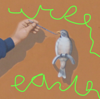
bird and hand by Greg Brown, typography graffiti by yo trulio
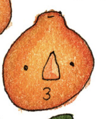
Orange fruit face by Robert Syrette:
Robbed
